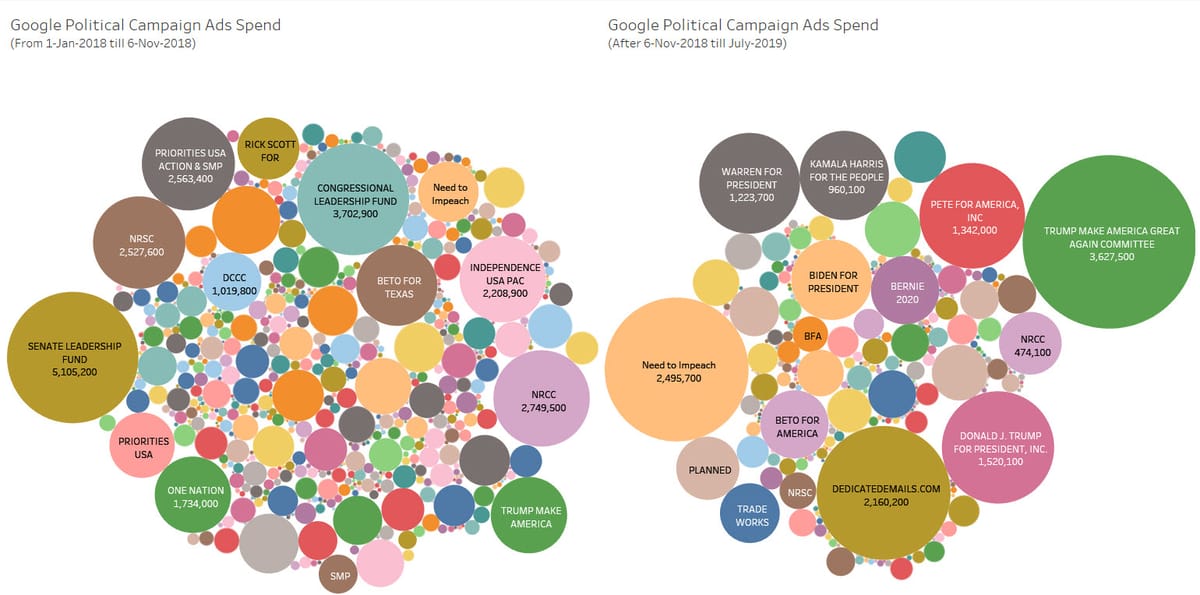
Visualizing Google Political Ads Spend by using BigQuery data and Tableau

While playing around with Google BigQuery public datasets which I think are fantastic, I found one database which shows an archive of political ads run on Google platform.
More details about the dataset can be found here.
The dataset includes 6 tables like below:
- Advertiser Stats (which includes information about advertiser name, id, public_id, total spend and total number of creatives)
- Advertiser Weekly Spend (weekly spend information by advertisers)
- Campaign targeting (targeting options chosen by advertisers)
- Creative stats (information related to the ads)
- Geo Spend (spend information by Geo locations)
- Top Keywords history (top keywords and how much each campaign paid for these keywords)
In overall, it is a great database to play around with so this is what I did 😀
I want to see which are biggest spenders during 2018 US Election Cycle (starting from 1-Jan-2018 till 6-Nov-2018) and after that period (after 6-Nov-2018 till July-2019). Also, I want to see the spending trend on a weekly basis by major advertisers (advertisers with more than 1 mil spend)
I extracted the data from BigQuery by using Tableau and visualized the rest from there.
The public Tableau dashboard can found here:
You can play around with dashboard viz to find out who spends how much during these two periods. As for next steps, I will probably play around with the data from the rest of the tables.